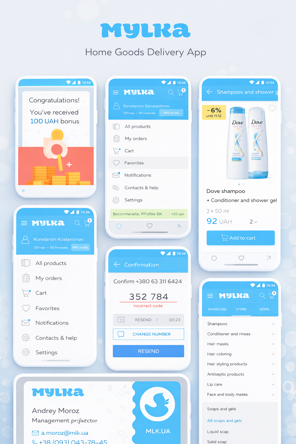
MYLKA is a mobile application designed for frequent, everyday purchases of home and personal care products.
The goal of this project was not visual decoration, but the creation of a
clear, scalable user experience built around speed, repetition, and ease of decision-making.
The product had to work for users who return weekly — not for one-time showcase sessions.
TASK
- Design a clear UX structure for a large product catalog
- Reduce friction between app launch and order completion
- Build logical user flows: onboarding, catalog, cart, confirmation
- Create a calm, trustworthy UI without aggressive promotional pressure
- Prepare a design foundation ready for scaling and iteration
STRATEGY
We started with
behavioral logic, not aesthetics.
Key strategic principles:
- prioritize recurring actions over exploration
- shorten the path to purchase
- eliminate visual and cognitive noise
- build predictable, readable interface patterns
Every decision was tested against a simple question:
“Would this feel effortless on the 10th order?”
DESIGN
The UI follows a restrained, functional visual language:
- soft, neutral color palette
- clearly structured product cards
- readable typography and strong hierarchy
- explicit system states (errors, confirmations, bonuses)
The interface doesn’t compete for attention —
it supports the task and gets out of the way.
UX DECISIONS
- Fast access to categories and favorites
- Clear presentation of discounts and bonuses without pressure
- Straightforward onboarding with no hidden steps
- Navigation built around habit, not discovery
- Confirmation screens designed to reduce user errors
RESULT
The client received:
- a structured UX ready for catalog growth
- a flexible design system for future updates
- an interface that requires no explanation
- a solid base for analytics, testing, and optimization
This project was delivered as a
product system, not a collection of screens.
OUR ROLE
UI / UX DESIGN
PRODUCT THINKING
USER FLOW ARCHITECTURE