JEEMA is a mobile service that helps drivers handle U.S. traffic tickets through a single, structured flow — from ticket upload to case tracking and resolution.
Because the domain is
inherently legal and stressful, the brand had to communicate authority and clarity without coming across as cold, corporate, or intimidating.
The core challenge was to build an identity that works equally well in
product UI,
app iconography, and
marketing, while staying highly recognizable at small sizes.
Task
Create a complete brand system for JEEMA, including:
- Logo (primary lockup + symbol)
- Brand guidelines (construction, safe area, usage rules)
- App icon system
- Color palette and contrast rules
- Typography recommendations
- Practical examples across UI and marketing components
Strategy
We built the identity around a simple idea:
legal clarity with road-level familiarity.
Instead of “law firm aesthetics,” the system borrows cues from transportation culture:
- Road badge silhouette for authority and instant recognition
- A bold “J” monogram shaped like a route element (lane/road detail inside the letter)
- A modular system that scales across mobile UI, app icon, and brand collateral
The brand acts as a “navigator” through the process — clear, structured, and predictable.
Brand Concept
JEEMA combines two signals that rarely coexist in legal products:
- Trust (structure, discipline, official-looking geometry)
- Approachability (warm accents, human tone, retro-road visual references)
The result is a brand that feels credible in a serious context but remains accessible for everyday users.
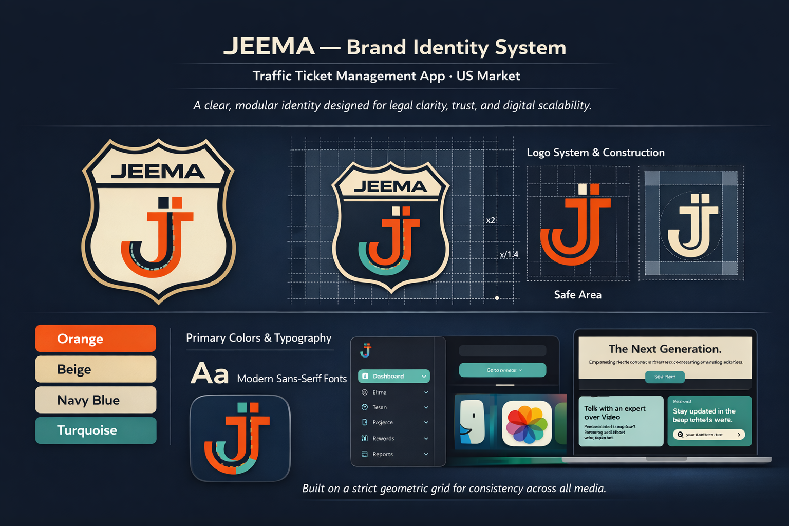
Logo System
The logo is designed as a strict, grid-based mark to ensure consistency and clean reproduction.
- Primary lockup: shield + wordmark + monogram
- Secondary mark: monogram “J” for compact use
- Defined safe area and spacing rules for predictable placement
- Monochrome variants for high-contrast backgrounds and print scenarios
This prevents “random” usage and keeps recognition stable across contexts.
Color & Typography
The palette is intentionally limited and high-contrast to work in UI states and marketing materials.
- Orange as the primary action/urgency signal
- Navy Blue as the core “trust” base
- Beige for warmth and legibility in light themes
- Turquoise for modernity and interface accents
Typography is positioned as a modern, readable sans-serif system: functional in UI, clean in headlines, neutral enough not to fight the logo.
Visual System & Applications
The guidelines focus on real-world usage, not decorative theory.
- App icon system that preserves legibility at small sizes
- Consistent usage examples on light/dark backgrounds
- UI-ready components that carry brand contrast and hierarchy
- Marketing layout examples with strong headline structure and clear CTAs
The identity is built to be used daily in product work without breaking.
Result
JEEMA receives a scalable brand system that supports a legal product without falling into the “sterile law-tech” look.
The logo and palette stay recognizable across app icon, interface, and promotional materials — while the visual language reinforces what users need most in this context:
clarity, control, and trust.
Client
JEEMA
Legal & Traffic Assistance Platform (USA)